In this post we will do a visual comparison of three spline methods: splines, natural splines, and smoothing splines. If you aren’t familiar with these see my previous post.
So far we have mostly stuck to the theory of splines. Let’s switch gears and see how we might actually implement them. We will do a visual comparison to help build our intuition for what all that theory looks like in practice.
A First Example
To start, we will generate some fake data so we can compare our fitted models to the true model. In this example we will use the polynomial \(y = 1 + 2x + 2x^2 + 4x^3\).
library(tidyverse)
library(splines)

theme_set(theme_bw())

set.seed(42)
x <- rnorm(500)
y <- 1 + 2*x + 3*x^2 + 4*x^3 + rnorm(500, sd = 5)
true_y <- 1 + 2*x + 3*x^2 + 4*x^3
df <- tibble(x, y, true_y)
The true model looks like this:
ggplot(df, aes(x, y)) +
  geom_point() +
  geom_line(aes(x, true_y), color = "#00CED1")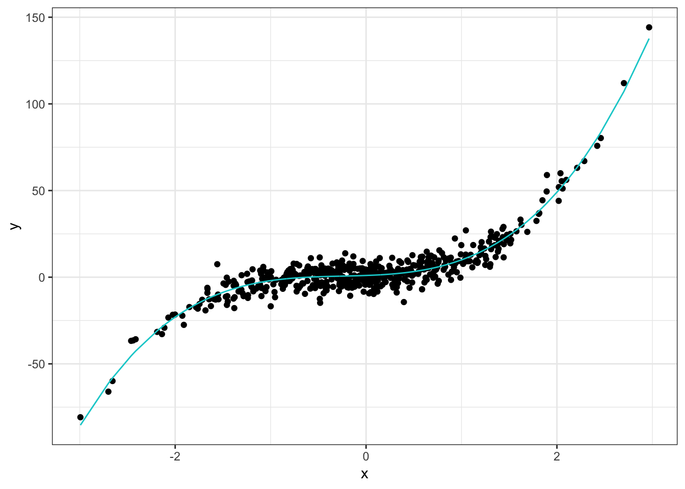
Not too complicated and something we might try to handle with linear regression because it has a pretty clear cubic shape. Now let’s fit our spline models and add those to the plots. The b_spline model is a regular spline but using the B-Spline basis for computational reasons, as we saw in A Bit More On Splines. For simplicity we specify 6 degrees of freedom for the spline and natural spline. In reality you would probably want to do some sort of cross validation which we do for the smoothing spline because it’s built into the function. The bs and ns functions are from the spline package and the smooth.spline function is in the stats package.
b_spline <- lm(y ~ bs(x, df = 6), data = df)
natural_spline <- lm(y ~ ns(x, df = 6), data = df)
smooth_spline <- smooth.spline(df$x, df$y, cv = TRUE)

# put everything together
model_df <- df %>%
  bind_cols(b_spline = b_spline$fitted.values,
            natural_spline = natural_spline$fitted.values,
            smooth_spline = fitted.values(smooth_spline)) %>%
  gather(true_y, b_spline, natural_spline, smooth_spline,
         key = "model", value = "fit")

ggplot(model_df, aes(x, y)) +
  geom_point() +
  geom_line(aes(x, fit, color = model))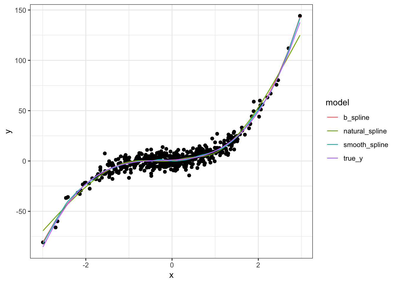
The three models are nearly identical and close match the underlying model. My suspicion is this is because we are using a polynomial as the true model. Since splines are essentially piecewise polynomials, it make sense they would be good approximations to a polynomial and would all be fairly close to each other.
The only place we see any real differences is in the boundaries which again should not be surprising. The spline and smoothing spline are pretty much the same but the natural spline is a bit further away from the true model. No doubt this is because smoothing splines are restricted to be linear in the boundary regions.
A More Complicated Example
Let’s look at an example with a more complicated underlying model. Here we will use the function \(y = \sin(2x) + e^{0.5x}\). The code is essentially the same as before so I omit it for this example1. The true model looks like this:
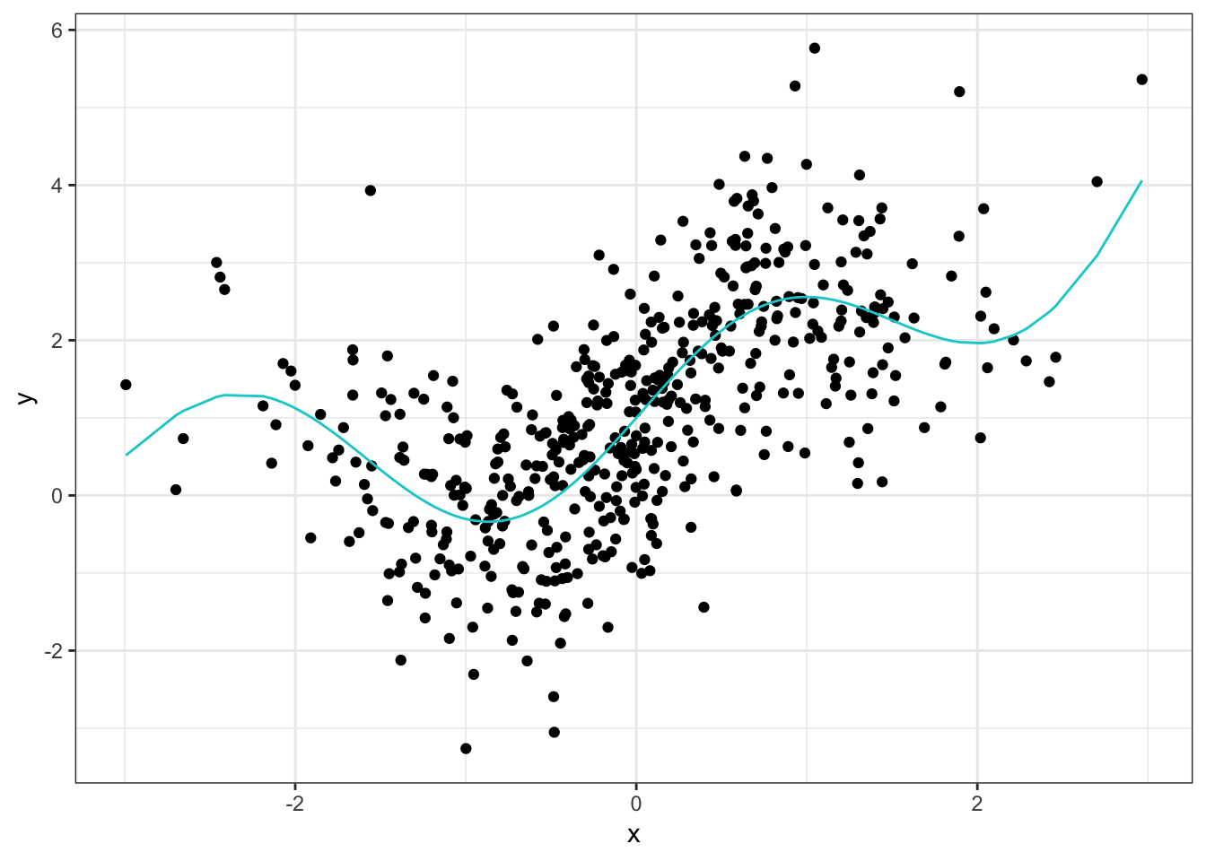
The relationship here is nowhere near as obvious as as in the first example where we could see that it looked cubic. Also note that there is quite a bit more noise in this data which should make it harder to fit. After fitting the same models (with the same parameters) we end up with:
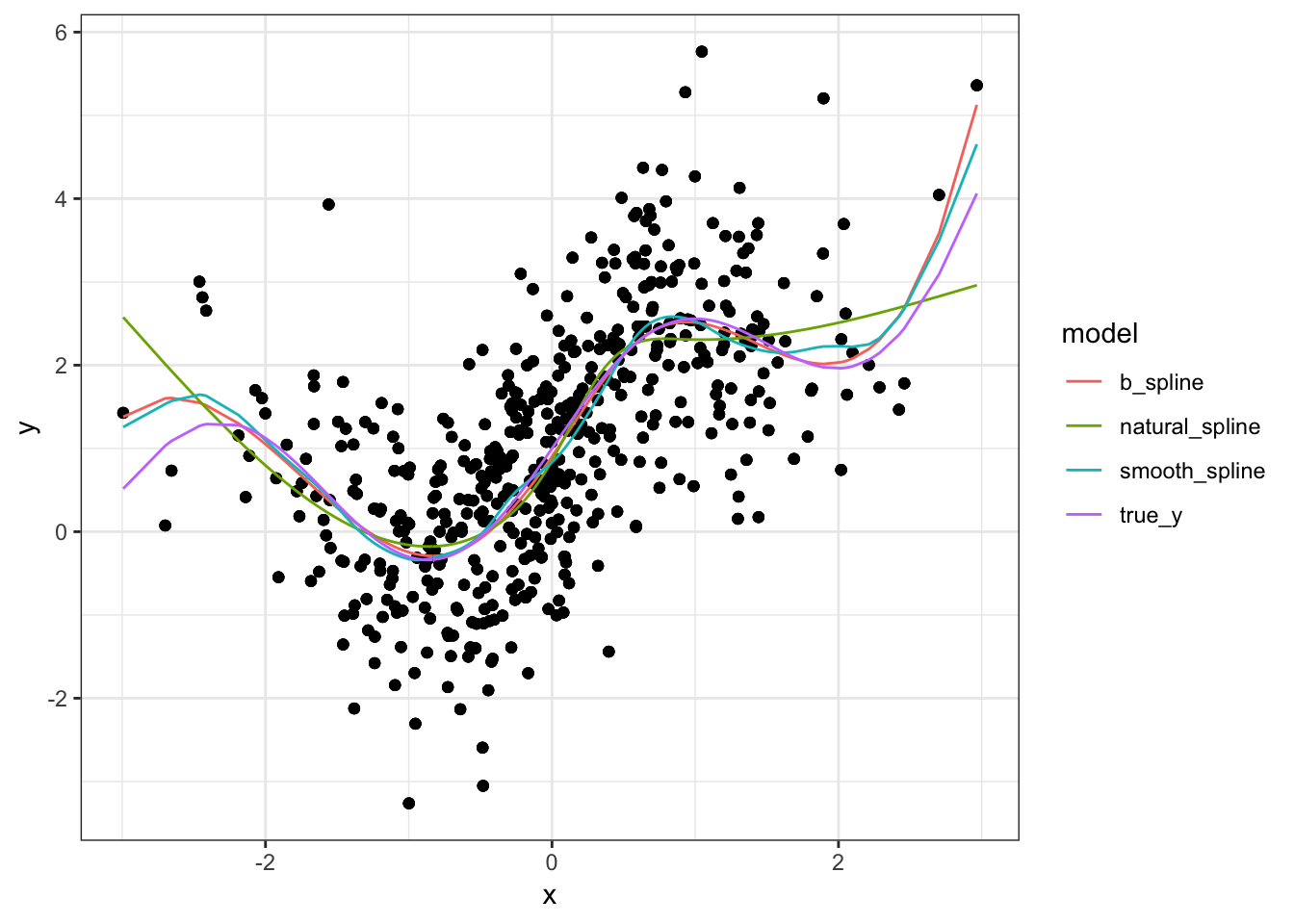
As expected, the fitted models are having a bit more trouble. In contrast with the polynomial fit, they are not as close to the true model in the interior regions and are noticeably different from each other. the same is true in the boundary regions, although the differences are more pronounced than with the polynomial model. If I had to pick one I would choose the smoothing spline. But to be fair, it has a slight advantage because it was chosen via cross validation. Had we done cross validation to choose the spline model (b_spline), it might have been a more difficult choice.
Conclusion
For the polynomial example, there wasn’t any real difference between the fitted models and they approximated the true model quite well. But when we shook things up by using a mix of sine and exponential, we could see some noticeable differences. This is understandable both because splines are extensions of polynomials and because the data in the second example was simply more complicated. For the polynomial example, we might have tried to use a linear regression with polynomial terms had we simply plotted the data. But trying to do that in the complex example would probably not go as well.
That’s pretty much all I have for univariate splines. In the next few posts we will look at how we can extend these ideas to higher dimensions which is more practically relevant.